import numpy as np

# Set seed
np.random.seed(1234)

n = 5000
rho = 0.8

# Covariance matrix
Sigma = np.array([[1, rho],
                  [rho, 1]])

# Cholesky decomposition (lower triangular in numpy)
L = np.linalg.cholesky(Sigma)

# Generate independent standard normals
Z = np.random.normal(size=(n, 2))

# Create correlated normals
X = Z @ L.T # equivalent to R's Z %*% L27 Python Workshop Solutions
Exercise 1: Correlated Normal Variable via Cholesky
- Use the Cholesky decomposition to simulate 5000 bivariate normal random vector with the following information: \[ \Sigma = \begin{pmatrix} 1 & 0.8 \\ 0.8 & 1 \end{pmatrix}, \quad \mu = \begin{pmatrix}0 \\ 0\end{pmatrix}, \quad \rho = 0.8. \]
- What is the approximate sample correlation between \(X_1\) and \(X_2\)?
# Sample correlation
corr = np.corrcoef(X[:,0], X[:,1])[0,1]

# Sample covariance matrix
cov_matrix = np.cov(X, rowvar=False)

print("Sample correlation:", corr)
print("Sample covariance matrix:\n", cov_matrix)
Sample correlation: 0.796961243571592
Sample covariance matrix:
[[0.98415666 0.78415824]
[0.78415824 0.98371385]]The sample correlation between \(X_1\) and \(X_2\) is approximately 0.638. This is positive, so the two variables tend to increase together. The sample covariance matrix also shows a positive covariance between \(X_1\) and \(X_2\). Since this is based on a simulated sample, it is only an approximation to the theoretical dependence.
- Plot \(X_1\) against \(X_2\). Why is the cloud elliptical rather than circular?
import matplotlib.pyplot as plt
# Scatter plot
plt.figure()
plt.scatter(X[:,0], X[:,1], s=5)  # s controls point size
plt.xlabel("X1")
plt.ylabel("X2")
plt.title("Correlated Normal Sample")
plt.show()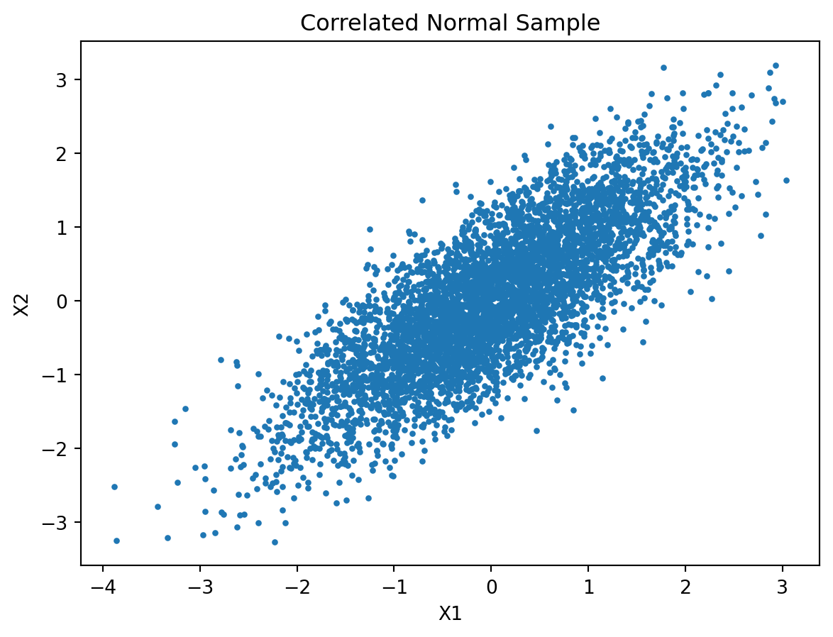
The cloud is elliptical rather than circular because the two variables are dependent. If \(X_1\) and \(X_2\) were independent standard normals, the scatterplot would look roughly circular, since the spread would be the same in all directions. Here, the Cholesky transformation introduces covariance, so the sample is stretched more along one direction than another. This creates a tilted elliptical cloud.
What role does the Cholesky factor play in the simulation?
The Cholesky factor is used to impose the desired covariance structure on independent standard normal draws. Multiplying by this factor transforms independent variables into correlated variables with covariance matrix approximately equal to \(\Sigma\).
Exercise 2: Linear Transformations of Random Vectors
Suppose \(\mathbf{X} \sim N(\mu, \Sigma)\), and define
\[ \mathbf{Y} = A\mathbf{X} + \mathbf{b}, \]
where
\[ A = \begin{pmatrix} 1 & 0 \\ -1 & 2 \end{pmatrix}, \qquad \mathbf{b} = \begin{pmatrix} 0 \\ 1 \end{pmatrix}. \]
- Generate \(\mathbf{X}\) from Exercise 1, then apply the transformation above.
# Matrix A and vector b
A = np.array([[1, 0],
              [-1, 2]])

b = np.array([0, 1])

# Apply linear transformation: Y = AX + b
# X is assumed to be (n x 2)
Y = X @ A.T + b # broadcasting handles + b- Plot the transformed \(Y_1\) against \(Y_2\). Compare it with the plot of original \(X_1\) against \(X_2\). How has the location and the shape of the cloud changed?
# Plot
plt.figure(figsize=(7.5, 3.5))

# Original X
plt.subplot(1, 2, 1)
plt.scatter(X[:,0], X[:,1], s=5, color='gray')
plt.xlabel("X1")
plt.ylabel("X2")
plt.title("Original X")

# Transformed Y
plt.subplot(1, 2, 2)
plt.scatter(Y[:,0], Y[:,1], s=5, color='tomato')
plt.xlabel("Y1")
plt.ylabel("Y2")
plt.title("Transformed Y = AX + b")

plt.tight_layout()
plt.show()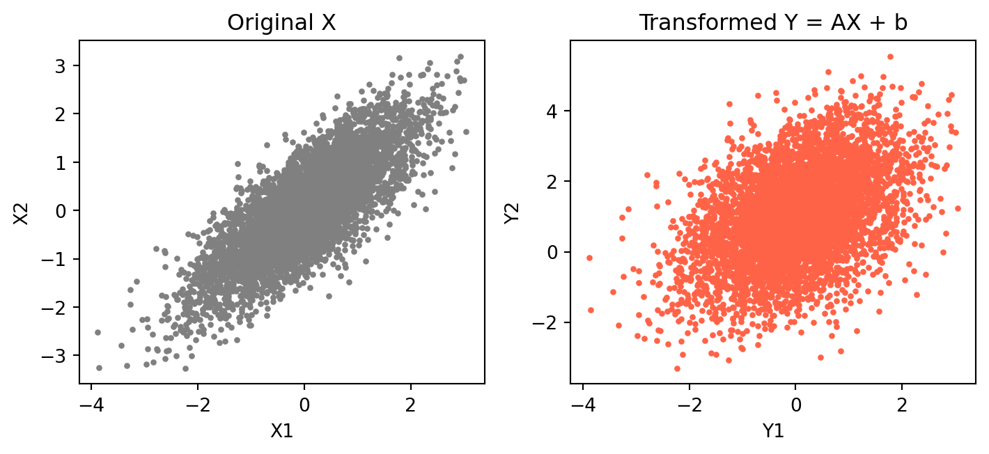
Compared to the original plot of \((X_1, X_2)\), the transformed variables \((Y_1, Y_2)\) show both a change in location and a change in shape.
- Location: The cloud has shifted upward. This is due to the addition of the vector \(b = (0,1)^\top\), which increases the mean of the second component.
- Shape: The original cloud is elongated along a diagonal (due to positive correlation). After transformation, the cloud becomes rotated and reshaped. The linear transformation A mixes the variables \((Y_2 = -X_1 + 2X_2 + 1)\), which changes both the direction and strength of dependence.
Overall, the transformation applies a combination of rotation, stretching, and shifting, resulting in a differently oriented elliptical cloud.
- Compute the sample mean of \(\mathbf{Y}\). Is it close to \(A\mu + b\)?
# Column means
print("Column means of Y:", Y.mean(axis=0))
Column means of Y: [0.01737221 1.02828018]The theoretical mean can be computed as follows:
\[ A\mu + b = \begin{pmatrix} 1 & 0 \\ -1 & 2 \end{pmatrix} \begin{pmatrix} 0 \\ 0 \end{pmatrix} + \begin{pmatrix} 0 \\ 1 \end{pmatrix} = \begin{pmatrix} 0 \\ 1 \end{pmatrix}. \]
The sample mean of \(\mathbf{Y}\) is approximately \((0.0174, 1.0283)\), which is close to the theoretical mean \(A\mu + b = (0,1)\). The small difference is due to sampling variability, since the result is based on a finite simulation.
Exercise 3: Simulating from a Multivariate Normal Distribution
Tip
You may also simulate multivariate normal data directly using np.random.multivariate_normal(mean, cov, size) from the numpy package.
- Generate 5000 observations from \[ \mu = \begin{pmatrix} 1 \\ 2 \end{pmatrix}, \qquad \Sigma = \begin{pmatrix} 4 & 1 \\ 1 & 1 \end{pmatrix}. \]
# Set seed
np.random.seed(1234)

# Mean vector and covariance matrix
mu = np.array([1, 2])
Sigma2 = np.array([[4, 1],
                   [1, 1]])

# Generate multivariate normal sample
X2 = np.random.multivariate_normal(mean=mu, cov=Sigma2, size=5000)

# Scatter plot
plt.figure()
plt.scatter(X2[:,0], X2[:,1], s=5, color='darkgreen')
plt.xlabel("X1")
plt.ylabel("X2")
plt.title("Bivariate Normal Sample")
plt.show()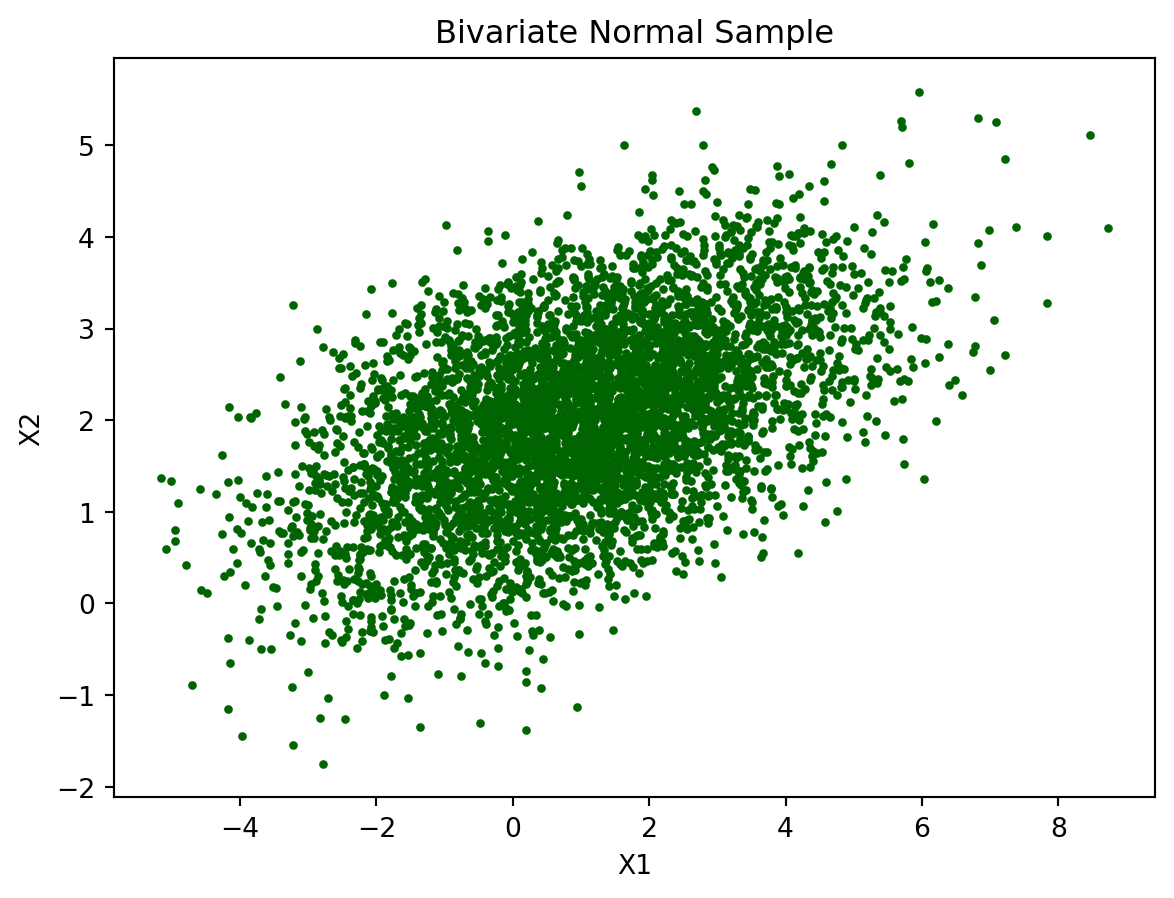
- Compare the sample mean with \(\mu\).
# Column means
print("Sample mean:", X2.mean(axis=0))
Sample mean: [0.96191013 2.00144976]The sample mean is approximately (0.96191013 2.00144976), which is very close to the theoretical mean (1,2). This suggests that the simulated data are centred around the correct location.
- Compare the sample covariance matrix with \(\Sigma\).
# Sample covariance matrix
print("Sample covariance matrix:\n", np.cov(X2, rowvar=False))
Sample covariance matrix:
[[3.93230736 0.98927966]
[0.98927966 0.9974324 ]]The sample covariance matrix is close to the theoretical covariance matrix. This indicates that the simulation reproduces the intended dependence structure quite well.
Why do the sample quantities differ slightly from the theoretical values?
The sample quantities differ slightly from the theoretical values because the simulation uses a finite sample of size 5000. Random variation means the sample mean and covariance will not match the population values exactly. As the sample size increases, the sample quantities should get closer to the theoretical values by the Law of Large Numbers.
Exercise 4: From Correlated Normals to Uniform Variables
A key step in copula simulation is transforming normal variables into uniforms using the normal CDF.
If \(Z \sim N(0,1)\), then
\[ U = \Phi(Z) \sim \text{Uniform}(0,1). \]
- Transform the correlated normals from Exercise 1 into uniforms.
from scipy.stats import norm

# Transform to uniforms using normal CDF
U = norm.cdf(X)- Plot the histogram for \(U_1\) and \(U_2\). Briefly explain the shape.
# Histograms
plt.figure(figsize=(7.5, 3.5))

plt.subplot(1, 2, 1)
plt.hist(U[:,0], bins=30, color='lightblue')
plt.title("Histogram of U1")
plt.xlabel("U1")

plt.subplot(1, 2, 2)
plt.hist(U[:,1], bins=30, color='lightgreen')
plt.title("Histogram of U2")
plt.xlabel("U2")

plt.tight_layout()
plt.show()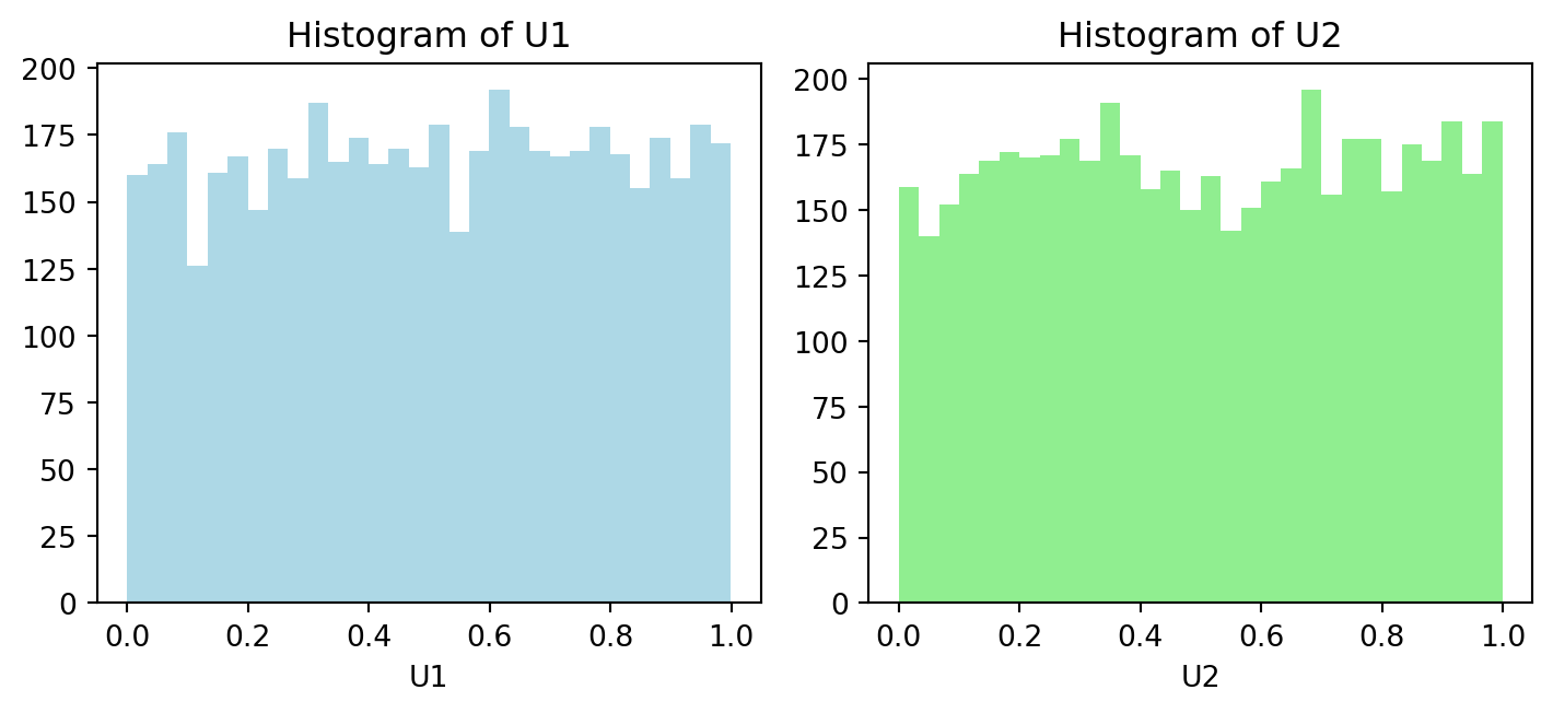
Both histograms are roughly uniform on (0,1), with only small random fluctuations due to finite sample size. This confirms that applying pnorm() to each normal margin has transformed the marginals into approximately Uniform(0,1).
- Plot \(U_1\) against \(U_2\). Are \(U_1\) and \(U_2\) independent?
# Scatter plot
plt.figure()
plt.scatter(U[:,0], U[:,1], s=5, color='purple')
plt.xlabel("U1")
plt.ylabel("U2")
plt.title("Dependent Uniform Variables")
plt.show()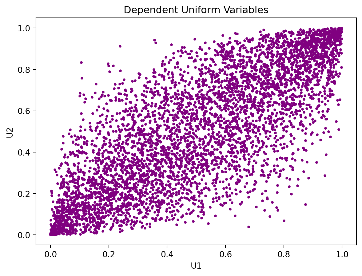
No, \(U_1\) and \(U_2\) are not independent. The scatterplot shows a clear positive association: larger values of \(U_1\) tend to occur with larger values of \(U_2\). If they were independent, the points would fill the unit square more randomly without a visible diagonal trend.
What feature of the original variables is preserved after applying
pnorm()?The marginals change, but the positive dependence and rank ordering are preserved.
Exercise 5: Gaussian Copula (Normal-Exponential)
- simulate:
- \(X \sim N(0,1)\)
- \(Y \sim \text{Exp}(1)\)
from scipy.stats import norm, expon

# Set seed
np.random.seed(1234)

n = 5000
rho = 0.7

# Correlation matrix
Sigma3 = np.array([[1, rho],
                   [rho, 1]])

# Step 1: latent correlated normals
Z = np.random.multivariate_normal(mean=[0, 0], cov=Sigma3, size=n)

# Step 2: transform to uniforms
U = norm.cdf(Z)

# Step 3: apply inverse CDFs
Xg = norm.ppf(U[:, 0])          # Normal(0,1)
Yg = expon.ppf(U[:, 1], scale=1) # Exp(1), scale = 1/lambda- Plot histogram for \(X\) and \(Y\). Briefly explain the shape.
# Histograms
plt.figure(figsize=(7.5, 3.5))

plt.subplot(1, 2, 1)
plt.hist(Xg, bins=30, color='lightgray')
plt.title("Marginal of X")
plt.xlabel("X")

plt.subplot(1, 2, 2)
plt.hist(Yg, bins=30, color='lightpink')
plt.title("Marginal of Y")
plt.xlabel("Y")

plt.tight_layout()
plt.show()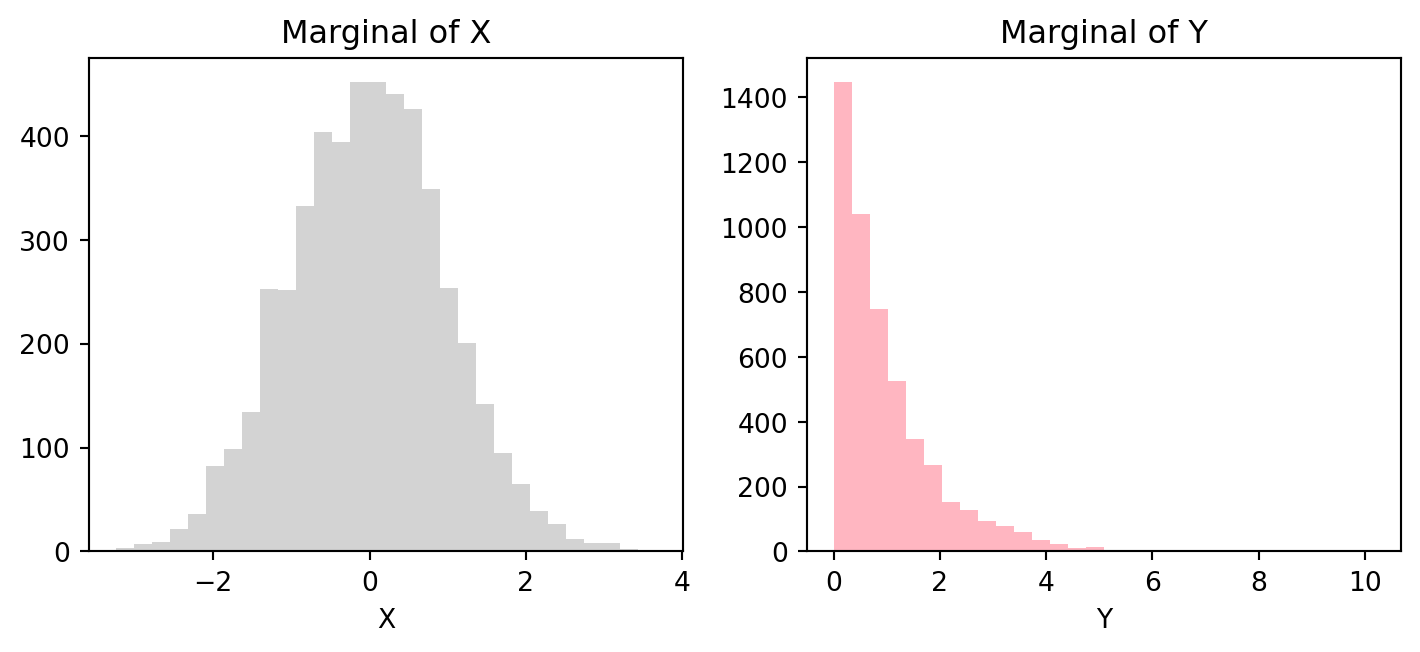
The histogram of \(X\) is approximately symmetric and bell-shaped, which is consistent with a Normal(0,1) distribution. The histogram of \(Y\) is right-skewed, with many small values and a long right tail, which is consistent with an Exponential(1) distribution. This shows that the copula approach preserves the chosen marginal distributions.
- Plot \(X\) against \(Y\). Briefly explain the dependence structure.
# Scatter plot
plt.figure()
plt.scatter(Xg, Yg, s=5, color='steelblue')
plt.xlabel("X ~ N(0,1)")
plt.ylabel("Y ~ Exp(1)")
plt.title("Gaussian Copula Simulation")
plt.show()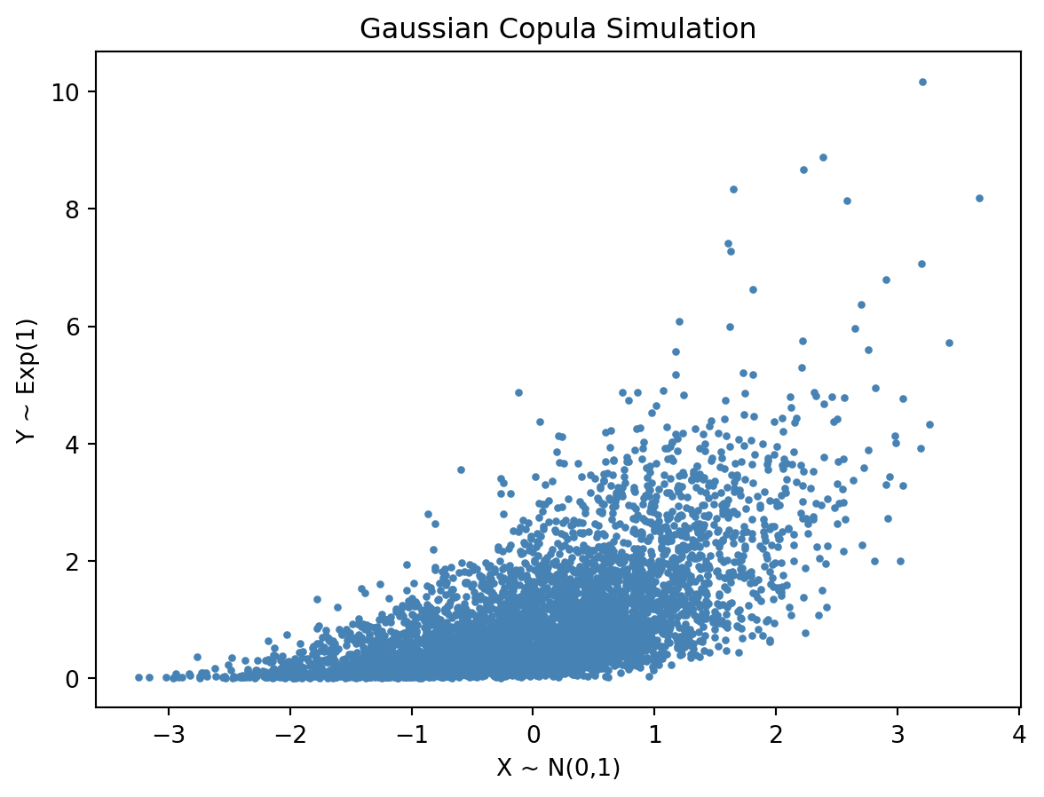
The scatterplot shows a positive dependence between \(X\) and \(Y\). Larger values of \(X\) tend to be associated with larger values of \(Y\). However, the cloud is not elliptical, because the marginals are different, one is normal and the other is exponential. The dependence is induced through the Gaussian copula, which links the variables through correlated latent normal variables.
- How is copula-based model different from a multivariate normal model?
In a multivariate normal model, everything is jointly normal. In a copula model, the marginals can be different, while the dependence is imposed separately through the copula.
Exercise 6: Gaussian Copula (Gamma-Beta)
- Simulate dependent variables with:
- \(X \sim \text{Gamma}(2,1)\)
- \(Y \sim \text{Beta}(2,5)\) using Gaussian copula with dependence parameter \(\rho = 0.6\).
from scipy.stats import norm, gamma, beta

# Set seed
np.random.seed(1234)

n = 5000
rho = 0.6

# Correlation matrix
Sigma4 = np.array([[1, rho],
                   [rho, 1]])

# Step 1: latent correlated normals
Z = np.random.multivariate_normal(mean=[0, 0], cov=Sigma4, size=n)

# Step 2: transform to uniforms
U = norm.cdf(Z)

# Step 3: apply inverse CDFs
Xnew = gamma.ppf(U[:, 0], a=2, scale=1)      # Gamma(shape=2, rate=1 → scale=1)
Ynew = beta.ppf(U[:, 1], a=2, b=5) # Beta(2,5)- Plot histogram for \(X\) and \(Y\). Briefly explain the shape.
# Histograms
plt.figure(figsize=(7.5, 3.5))

plt.subplot(1, 2, 1)
plt.hist(Xnew, bins=30, color='orange')
plt.title("Gamma Marginal")
plt.xlabel("Xnew")

plt.subplot(1, 2, 2)
plt.hist(Ynew, bins=30, color='skyblue')
plt.title("Beta Marginal")
plt.xlabel("Ynew")

plt.tight_layout()
plt.show()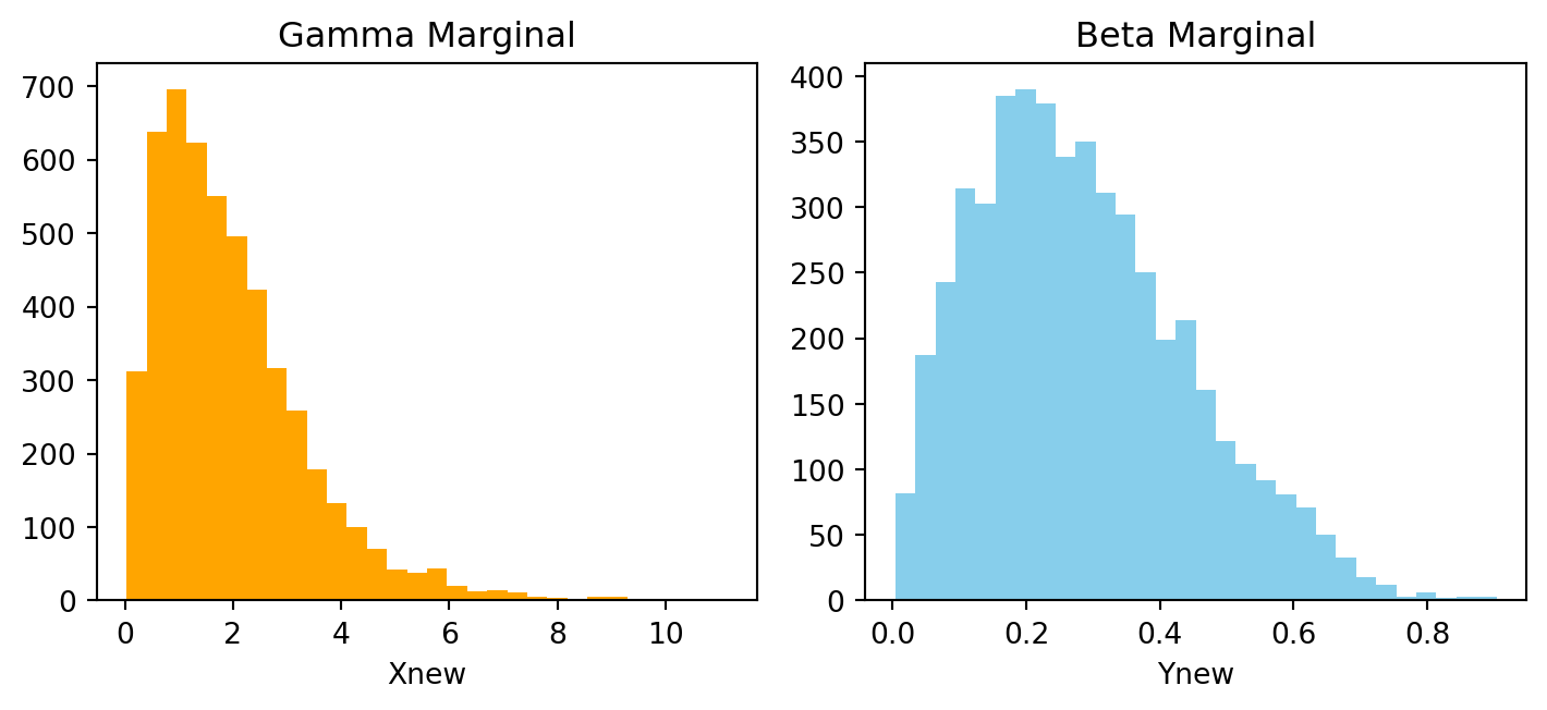
The histogram of \(X\) is right-skewed, with most values concentrated near smaller positive values and a long tail to the right. This is consistent with a Gamma(2,1) distribution.
The histogram of \(Y\) is bounded between 0 and 1 and is also right-skewed, with most values concentrated near the lower end of the interval. This matches the shape of a Beta(2,5) distribution.
These histograms show that the copula method preserves the chosen marginal distributions.
- Plot \(X\) against \(Y\). Briefly explain the dependence structure.
# Scatter plot
plt.figure()
plt.scatter(Xnew, Ynew, s=5, color='brown')
plt.xlabel("Xnew")
plt.ylabel("Ynew")
plt.title("Dependent Non-Normal Variables")
plt.show()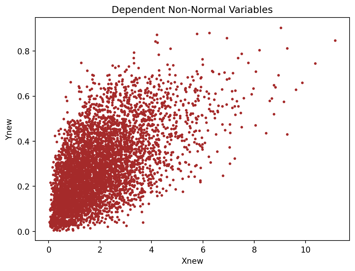
The scatterplot shows clear positive dependence, since larger values of \(X\) tend to be associated with larger values of \(Y\). The cloud is not elliptical because the variables are not jointly normal. The dependence comes from the Gaussian copula.
Exercise 7: Gaussian Copula (Normal-Exponential-Gamma)
- Simulate three dependent variables:
- \(X_1 \sim N(0,1)\)
- \(X_2 \sim \text{Exp}(1)\)
- \(X_3 \sim \text{Gamma}(3,2)\)
- using a Gaussian copula with correlation matrix \[ \Sigma = \begin{pmatrix} 1 & 0.6 & 0.3 \\ 0.6 & 1 & 0.5 \\ 0.3 & 0.5 & 1 \end{pmatrix}. \]
from scipy.stats import norm, expon, gamma

# Set seed
np.random.seed(1234)

n = 5000

# Correlation matrix
Sigma5 = np.array([[1, 0.6, 0.3],
                   [0.6, 1, 0.5],
                   [0.3, 0.5, 1]])

# Step 1: latent correlated normals
Z5 = np.random.multivariate_normal(mean=[0, 0, 0], cov=Sigma5, size=n)

# Step 2: transform to uniforms
U5 = norm.cdf(Z5)

# Step 3: apply inverse CDFs
X1 = norm.ppf(U5[:, 0])              # Normal(0,1)
X2 = expon.ppf(U5[:, 1], scale=1)    # Exp(1)
X3 = gamma.ppf(U5[:, 2], a=3, scale=1/2) # Gamma(shape=3, rate=2 → scale=1/2)- Plot marginal histograms and pairwise scatterplots.
# Histograms
plt.figure(figsize=(7.5, 3.5))

plt.subplot(1, 3, 1)
plt.hist(X1, bins=30, color='orange')
plt.title("Normal Marginal")
plt.xlabel("X1")

plt.subplot(1, 3, 2)
plt.hist(X2, bins=30, color='skyblue')
plt.title("Exponential Marginal")
plt.xlabel("X2")

plt.subplot(1, 3, 3)
plt.hist(X3, bins=30, color='lightgreen')
plt.title("Gamma Marginal")
plt.xlabel("X3")

plt.tight_layout()
plt.show()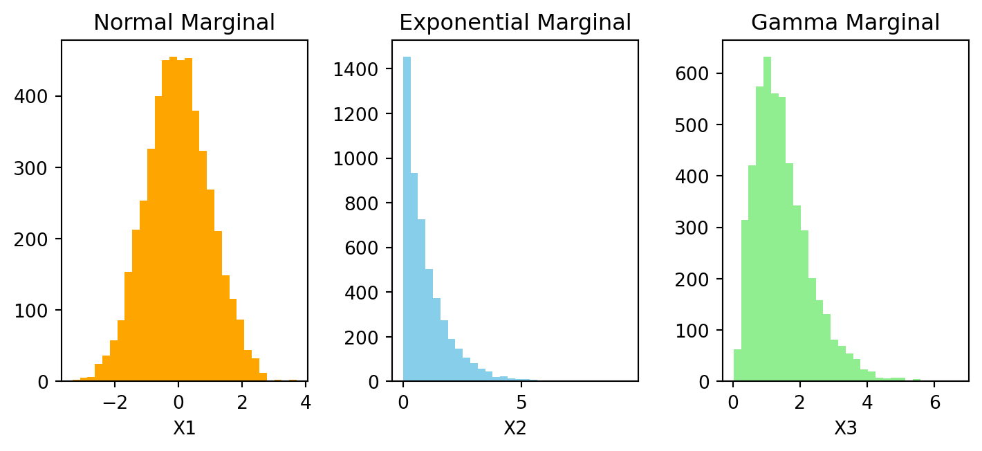
The histograms should show the intended marginal shapes with
- \(X_1\) is approximately symmetric and bell-shaped, consistent with N(0,1),
- \(X_2\) is right-skewed, consistent with (1),
- \(X_3\) is positive and right-skewed, consistent with (3,2)
# Pairwise scatter plots
plt.figure(figsize=(7.5, 3.5))

plt.subplot(1, 3, 1)
plt.scatter(X1, X2, s=5, color='navy')
plt.xlabel("X1")
plt.ylabel("X2")
plt.title("X1 vs X2")

plt.subplot(1, 3, 2)
plt.scatter(X1, X3, s=5, color='navy')
plt.xlabel("X1")
plt.ylabel("X3")
plt.title("X1 vs X3")

plt.subplot(1, 3, 3)
plt.scatter(X2, X3, s=5, color='navy')
plt.xlabel("X2")
plt.ylabel("X3")
plt.title("X2 vs X3")

plt.tight_layout()
plt.show()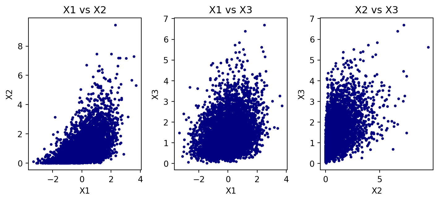
The pairwise scatterplots should show positive dependence in each pair, although the clouds will not generally be elliptical because the marginals are not all normal.
- Check the sample correlation matrix.
# Correlation matrix of latent normals
print("Correlation matrix of Z5:\n", np.corrcoef(Z5, rowvar=False))
Correlation matrix of Z5:
[[1. 0.59821225 0.30532055]
[0.59821225 1. 0.51671856]
[0.30532055 0.51671856 1. ]]The latent Gaussian correlation matrix should be close to the target matrix.